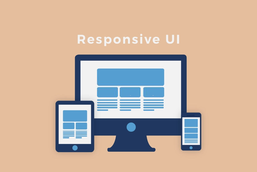
What is a Responsive website?
Responsive design is an approach to website page creation that makes use of flexible layout, flexible images, and cascading style sheet media queries. The goal of responsive design is to build web pages that detect the visitor's screen size and orientation and change the layout accordingly.
Advantages of Responsive Website
Future Ready
The screen sizes of devices are continually changing, as we have seen in a couple of years. People are accessing information from all kinds of devices as the journey from desktop/laptops to smartwatches has been relatively quick. A website must render well across all devices in the market to get the highest exposure.
It's Fast and Smart
A responsive web design WSNE Consulting offers excellent user experience, and in today's world, surviving in the digital market is all about providing the best user experience.
Cost-Effective
The development of a responsive website requires longer time, but the result is rewarding. Earlier, the web developers had to maintain multiple versions of sites suitable for smartphones, tablets, and desktop. Managing all the versions of the website is time-consuming and expensive, which can be done away in responsive web design. Here, you have to maintain only one version, and the web servers make the needed changes to the layout whenever required.
Great SEO
Multiple versions of the website lead to having duplicate content on your website. There are procedures to notify the search engine that you are maintaining a different version of a website, but this also means unnecessary additional tasks. It is widely recommended to have a responsive web design, as it is easier for the crawlers to index the website's content. Besides, the mobile site may have a different URL. A different URL can affect the SEO ranking for the website.
User Experience
A responsive website renders an enhanced user experience to the users. It's a very critical aspect that the search engines take into consideration for determining the rank of the website. The ultimate goal of any website is to be able to communicate the ideas to the users and get a higher conversion rate. Responsive website design assures the end goal is being met efficiently. A great user experience translates to a positive, perceived awareness for businesses.
More Mobile Traffic
According to a report from SimilarWeb, more than half of the traffic to the top website in the U.S came from mobile devices in 2015. Therefore, it's increasingly essential for companies to have websites that render correctly on smaller screens so that users don't encounter distorted images or experience a sub-optimal site layout. While some businesses still choose to have a separate version of their website for a smartphone user, responsive design is becoming the norm because it offers greater versatility at lower development costs.
Lower Bounce Rates
A responsive and optimized mobile web design provides a much better user experience for the visitor. Therefore, it is much more likely that they'll stick around for a more extended period and explore different areas of your site. Alternatively, if your website isn't responsive, it is much harder to keep the visitor engaged and, therefore, more likely that they'll bounce.
Higher Conversion Rates
Lowering your bounce rate is only half of the battle. Creating a consistent user experience across all devices is key to converting new customers. When users are choosing whether or not to subscribe to a service, they don't want to be redirected to device-specific websites because the process often takes longer. Having a single secure website that looks professional on all platforms makes users less likely to get frustrated or turn to a competitor.